When a report is designed and produced in English and Arabic, both editions should feel equally considered. The brand should be recognisable, the information clear and the reading experience natural.
Achieving that takes accurate translation and specialist design working together.
A layout developed for English will not automatically work as well when its content is replaced with Arabic. The reading direction changes. Typography behaves differently. Headings, captions and supporting information may need more space or a different arrangement.
This is where design arabisation adds value.
What is the difference between translation and arabisation?
Professional translation carries meaning from one language into another, with careful attention to tone, terminology and context. It helps ensure that the Arabic communicates the intended message accurately and appropriately.
Design arabisation considers how that translated content works within the publication.
It addresses the layout, typography, navigation and visual relationships that help Arabic readers move through the information. The two disciplines complement each other: well-translated content needs a design that supports it, just as a well-designed page needs accurate language.
Reading direction changes the page
English generally reads from left to right; Arabic reads from right to left. That affects more than paragraph alignment.
Consider a spread with an introductory statement on one page and supporting figures on the other. The arrangement establishes a sequence: where the reader begins, what they notice next and how the supporting information connects.
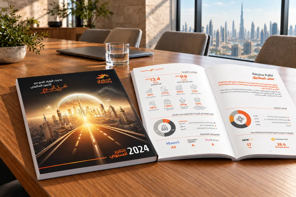
In the Arabic edition, that sequence needs to be reconsidered. Headings, columns, captions and navigation should guide the reader naturally through the content.
Simply placing Arabic text into the existing English layout can preserve the appearance of the page while weakening its flow.
Typography needs its own attention
Arabic has its own letterforms, proportions and typographic conventions. Choosing a suitable Arabic typeface means considering both readability and its relationship with the brand’s English typography.
The two fonts should feel related in character and emphasis, even when they look different.
Text also occupies space differently across languages. A heading may break across a different number of lines. A paragraph may need a revised column width or more breathing room. Captions and labels may require repositioning.
These decisions help both editions achieve a comparable hierarchy and level of polish.
Consistency does not mean identical layouts
The aim is to create two publications that clearly belong to the same organisation.
Colour, imagery, graphic language and the treatment of key information can provide continuity. Within that shared system, each edition needs room to respond to its language.
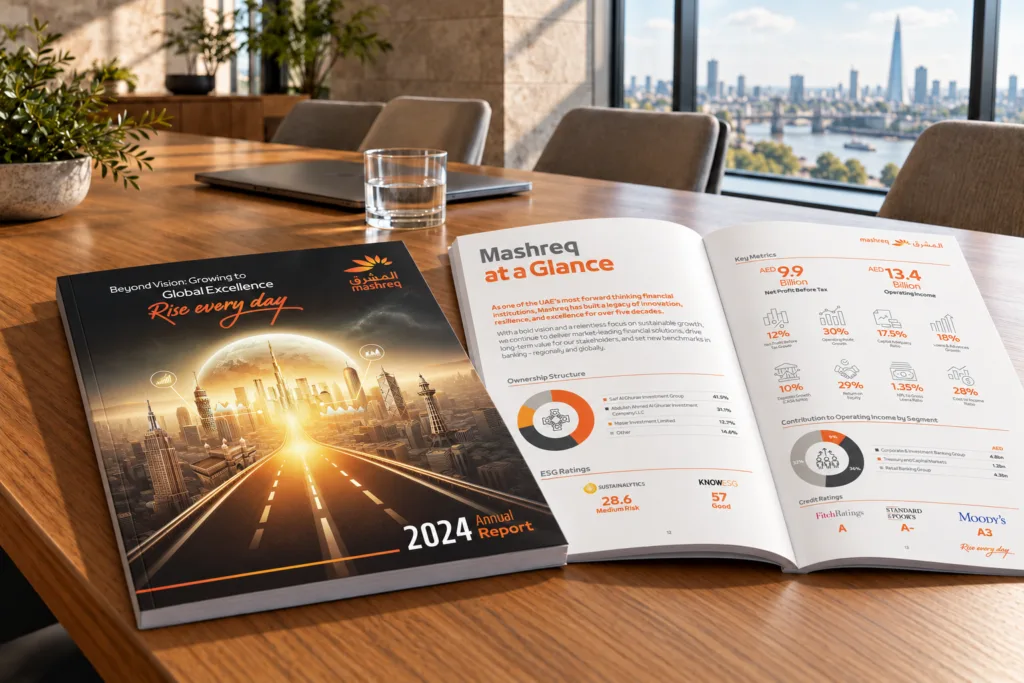
Our work on Mashreq’s 2024 annual report illustrates this relationship. The English and Arabic editions share a distinctive visual identity, while the arrangement of content adapts to their respective reading flows.
Viewed together, they feel connected. Read individually, each should make sense on its own.
That connection begins with a clear story. As we explore in Finding the Thread: How to Develop an Annual Report Theme That Actually Works, a report’s theme should guide its content and design. That same thinking needs to carry through both language editions.
Specialist judgement matters in the details
Arabisation also requires care with charts, tables, figures and mixed-language content.
An Arabic page can contain English brand names, numerical values and other elements with their own direction and formatting requirements. These need deliberate handling. Reversing every element would be as unhelpful as leaving everything untouched.
Designers and language specialists need to review the finished publication together, checking how the words and visuals work in context. This is where awkward line breaks, unclear relationships and inconsistencies can be identified before publication.
Allowing time for this matters. Our article on planning your annual report early explains the value of coordinating content, design, translation and approvals from the outset.
Give both audiences the same care
Our annual report design work for clients including Mashreq and Dubai Residential REIT reflected the importance of bringing complex information, brand identity and clear communication together.
For readers, the value is straightforward: a report that is easier to navigate, understand and engage with.
For the organisation, it means presenting a consistent identity while respecting the needs of each audience.
At Formulate, our approach to English and Arabic publication design considers that relationship from the outset. We focus on how each edition works for its readers, while keeping both firmly connected to the same brand.
Planning an English and Arabic report? Explore our annual report design services and let’s discuss your next publication.